What are Hamburger Menus?


 Rekindling the Discussion

From slack #general:
UX / HCI related items
[12:08]hidden nav reduces overall user engagement 2014 http://thenextweb.com/dd/2014/04/08/ux-designers-side-drawer-navigation-costing-half-user-engagement/

The Next Web
Side Drawer Navigation Could Cost Half Your User Engagement
The side menu has become fashionable on Android but not yet taken off on iPhone… but used inappropriately and you could use half your user engagement. (369KB)
April 8th, 2014 at 10:16 AM
[12:08]
menu > hamburger icon from 2014 http://exisweb.net/menu-eats-hamburger
----- October 19th, 2015 -----
alilja [10:06 AM]
is anybody really surprised that hiding critical information and using unclear icons reduces user engagement?
[10:07]
i think the trouble is really explaining an abstract concept like a “menu” through an icon
[10:07]
it’s sort of this weird grey area between mobile and desktop
[10:08]
mobile apps want to show everything onscreen because they’re supposedly simpler
[10:08]
they have less to do, and so they can show more of it. desktop applications, even the most complicated ones, still show most things
[10:08]
you have a toolbar and/or a menu bar
[10:09]
so maybe it’s really less about the right icon and more about what level of complexity is right for your application
[10:09]
it’s EASY to just slap a menu drawer into a mobile app and call it a day, but i don’t think that’s usually the right move
alilja [10:15 AM]
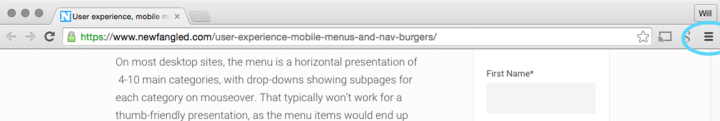
better solutions: https://www.newfangled.com/user-experience-mobile-menus-and-nav-burgers/
Newfangled

User experience, mobile menus, and nav burgers
Using the triple bar menu icon (also known as the "nav burger") may be the popular icon choice these days for representing your mobile menu, but is it well understood by users? The answer is less straightforward than you might think. Here are some ways to avoid user experience pitfalls on a phone-sized screen. (12KB)
April 7th, 2014 at 11:00 PM
bhaskarb04 [10:15 AM]
I would think the concept of menus need to be defined for the user or rather type of user expert vs novice. Novices generally do less and hence dont need all the extra fluff (also makes the code more stable)
[10:16]
Experts need the fluff and are usually aware of the norms in terms of the UI
[10:16]
Now if a novice intends to move to expert then I think the software should be able to detect that
alilja [10:16 AM]
i’m not even sure it’s an expert vs. novice thing here so much as it is a question of what’s actually useful to have in a mobile app
[10:17]
if you use a hamburger icon on a full-screen application or website you have failed in your job as a designer
bhaskarb04 [10:17 AM]
How so?
[10:18]
Because its too easy?
[10:18]
I'd rather see consistency than different UIs for mobile vs desktop
alilja [10:19 AM]
because you have so much screen real estate and so much more flexibility, it’s absurd to think you have to hide anything behind a generic MENU button
[10:19]
look at photoshop; it’s fantastically complicated but you can still access 90% of the stuff you need at any time
wstone [10:19 AM]
uploaded an image: Huh.
Add Comment
alilja [10:19 AM]
yeah, that drives me crazy
[10:20]
you click that and you get what amounts to a menu bar
[10:20]
it’s even worse on the mac because the options in there are different than on windows or linux because some of them got moved to the _actual menu bar_
bhaskarb04 [10:20 AM]
but if you are a novice photoshop user then that stuff drives you nuts softwares I feel need to progress
alilja [10:21 AM]
look at this bananas menu http://bit.ly/1hEgf2h (89KB)
bhaskarb04 [10:21 AM]
with the user intent
alilja [10:21 AM]
they have an edit menu that’s a potential selection in a regular menu, but instead of making it a sub-menu like they should have done, they totally break the extremely common paradigm and put BUTTONS in there
bhaskarb04 [10:21 AM]
If I get better at using novice tools software should say "Hey you might want to check out more tools"
alilja [10:22 AM]
that should have been an edit menu, not this monstrosity
[10:22]
@bhaskarb04: sure but photoshop never claims to be for novices
bhaskarb04 [10:22 AM]
I dont think there is a person under 50 who uses Edit for copy pasting
[10:22]
Thats bad!!!
[10:23]
Why do I need to read a book to use a software to figure out how change my background color
[10:23]
or make things transparent
[10:23]
Games do a really good job with that
[10:23]
they take it a small step at a time
[10:24]
unless you say that you're an expert and they let you dive right in
alilja [10:24 AM]
and game tutorials are always terrible
[10:24]
because they rarely ever let you do that
[10:24]
i agree that discover-ability is good, but not hand-holding
bhaskarb04 [10:24 AM]
well in my head I'm thinking AAA games like assassins creed or gta v
alilja [10:25 AM]
i can’t think of any game made in the last 10 years that let you skip the tutorial
bhaskarb04 [10:25 AM]
fifa
[10:25]
:stuck_out_tongue: :P
alilja [10:25 AM]
haha okay, fair
but every first-person game ever still forces you to go through an inane tutorial so you learn how the controls work
mark my words, halo 5 will do that too
bhaskarb04 [10:25 AM]
no but fifa has the adv of 10 years console research
alilja [10:25 AM]
and yet very few of them give you the option of changing things like inversion
bhaskarb04 [10:26 AM]
yes but you dont want to be like hey I didnt know that cool new move
alilja [10:26 AM]
i do remember playing one game that did something very cool; it had you look at targets, and if you looked down instead of up, it would immediately ask you if you wanted to invert the look
wish i could remember what game that was
bhaskarb04 [10:26 AM]
I think assasins creed does a good job cause it just gives you hints on what buttons to do what
alilja [10:26 AM]
anyway, discover-ability shouldn’t prevent you from accessing the features you need
 i shouldn’t need to DISCOVER what’s behind a hamburger menu if it contains essential stuff
i remember when i needed to figure out where Chrome was stashing my downloads, i had to google it
bhaskarb04 [10:27 AM]
lol
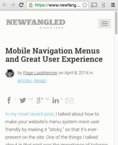
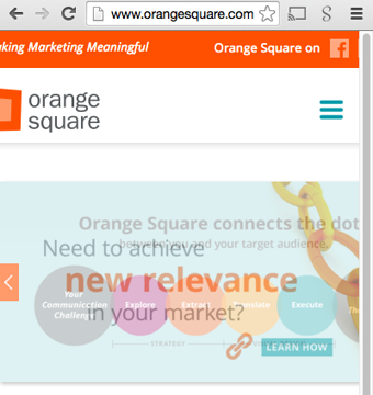
wstone [10:27 AM]
Did you see that both NewFangled and Orange Square use nav-burger now?
alilja [10:27 AM]
in safari and firefox, there’s a button on the toolbar that shows you your downloads
wstone [10:28 AM]
uploaded an image: Newfangled Nav
bhaskarb04 [10:28 AM]
chrome is menu-> downloads
wstone [10:28 AM]
uploaded an image: Orange Square Nav
bhaskarb04 [10:28 AM]
I guess
alilja [10:28 AM]
the irony bowls me over @wstone
hiding stuff is almost never a good idea
bhaskarb04 [10:28 AM]
its hard to say which features is more useful
alilja [10:28 AM]
especially if you’re hiding things _you want people to interact with_
bhaskarb04 [10:29 AM]
Point is I think that most people here are experts so its a little hard to say
cause we are kinda biased
a novice might never need to use the menu
cause a novice will download it will show up below and he can then open the folder from there
alilja [10:30 AM]
well, in that article chase posted they wanted people to use the stuff in the menu and people weren't
bhaskarb04 [10:30 AM]
if he/she wants to
lol I didnt see that
wstone [10:31 AM]
@bhaskarb04: agreed.
bhaskarb04 [10:31 AM]
I jumped in at your rant
alilja [10:31 AM]
that’s why we use data, right? so that our biases are as removed as possible
and there’s tons of data out there that shows that hamburger menus are a Bad Idea
bhaskarb04 [10:32 AM]
hehe but is it really?
I wouldnt call myself a fan but I dont see anything better out there
in terms of a good menu interaction
alilja [10:33 AM]
do the research to figure out what features your users are using and what you want them to use, and then design an interface that makes it easy to get to those
don’t hide stuff you want people to use
wstone [10:33 AM]
@alilja: yes, but the difference in that example is that fitting the nav items horizontally worked in the design because of really careful information architecture. For most sites, 375px of width would barely get you two top-level items
alilja [10:33 AM]
^ bingo
do a really careful job
bhaskarb04 [10:34 AM]
easier said than done
alilja [10:34 AM]
yeah, so?
bhaskarb04 [10:34 AM]
targets need to be met
i mean time targets
alilja [10:35 AM]
that’s fair
but that’s a different argument
bhaskarb04 [10:35 AM]
what about a menu button which has stuff in it but you can reconfigure your tools bar accordingly iwht ut
like drag drop buttons
alilja [10:35 AM]
because barely anybody will use it
wstone [10:35 AM]
and my experience is that information architecture is (unfortunately) a whole different conversation from design
bhaskarb04 [10:35 AM]
true
alilja [10:35 AM]
if people aren’t opening _menus_, they sure as hell aren’t going to customize their menus
they go hand in hand, don’t they?
bhaskarb04 [10:36 AM]
well if they see downloads is in menu only then they might just dsrag it out
for quick access
quick access buttons is what I like (MS office does a decent job with that)
but again that probably an expert feature
wstone [10:37 AM]
appreciate the conversation, this has given me a couple of ideas to try on the new ISU template
alilja [10:38 AM]
anecdotally, the ribbon is MS office is a trainwreck
bhaskarb04 [10:38 AM]
yeah its not very intuitive initially
alilja [10:38 AM]
until they got used to it, people didn’t know where their stuff was
not only did it get moved to the toolbar, things got renamed and reclassified
bhaskarb04 [10:39 AM]
yeah but its one of those things which is hard to do a gradual transition
alilja [10:39 AM]
i was using a lot of lab software around the time the switch was rolling out, and having to switch between three different versions of software all with different toolbars and things in different places was terrible
i think it’s fundamentally a good idea to make these things more obvious and easier to access, but the implementation is terrible
bhaskarb04 [10:39 AM]
i want to laugh but Im afraid of karma
crmeusel [12:14 PM]
Once Slack introduces comment threading, I will have significantly less complaining to do about it.

https://slack.zendesk.com/hc/en-us/articles/203274767-Quoting-a-message
You can quote a previous message in Slack by right clicking the timestamp of the message you would like to refer to and select "Copy Link". Paste the URL into the message input box and then send... (11KB)
[12:19] This could be the theme of our generation https://teamisux.slack.com/archives/general/p1445269199000117
bhaskarb04
"i want to laugh but Im afraid of karma"
Posted in #generalOct 19th, 2015 at 10:39 AM
-


Desarae Veit
Senior UI/UX web designer at a large-scale IT contractor for defense, intelligence, and civilian government solutions. Adventurist and certified Yoga / Barre Instructor. Love aviation, books, and travel.Prefer long light hearted series in mystery, comedy, fantasy, and romance.
More About the AuthorShare This Post
No comments:
Post a Comment
Backlinks will be hidden. Crude comments may be removed.